

Mobile commerce now dominates the retail landscape, yet a staggering number of online stores continue to bleed revenue due to a frustrating mobile user experience (UX). If your customers are struggling with a hard-to-use search bar, clumsy filter drawers, or slow load times, you are creating friction that kills conversions instantly.
Mobile product discovery isn't about building apps or complex coding; it's about removing barriers between your customer and the 'Add to Cart' button. It ensures shoppers can find exactly what they need on a 5-inch screen without frustration. This guide explains how to audit your store for "thumb-friendliness" and introduces Rapid Search, a mobile-first solution designed to fix the mobile conversion funnel for Shopify stores.
What is mobile product discovery?
Mobile product discovery is the journey a customer takes from landing on your site to finding the item they want. On mobile, this journey is defined by physical constraints: limited screen space, the need for speed, and the ergonomics of the human thumb.
Unlike desktop browsing, where users have a precise mouse and a large monitor, mobile discovery is messy and fast. It relies on touch interface principles. A successful discovery process ensures that the search bar, navigation, and filters are not just visible, but physically accessible within the "thumb zone"—the area of the screen a user can comfortably reach with one hand. If a user has to stretch their hand or zoom in to click a link, discovery has failed.
The high stakes of mobile commerce and the problem of poor discovery
Mobile commerce is no longer just a growing trend; it is the critical battleground for sales growth. However, its vast potential is often wasted. When users encounter ineffective m-commerce navigation, difficult touch targets, or slow response times, they don't complain—they just leave. This friction leads directly to lost sales and diminished user engagement.
For Shopify store owners, the stakes are incredibly high. If your site relies on mouse-driven search paradigms (like tiny lists and hover states) instead of optimizing for swipe gestures and the thumb zone, you are leaving significant revenue on the table.
How to identify user needs: The "Thumb Zone" Audit
The foundation of successful mobile discovery is empathy for the physical reality of using a phone. You don't need a research team to identify user needs; you just need to audit your store from the perspective of a shopper holding a device in one hand.

Identify the core problem
Most mobile themes are just squashed versions of desktop sites. This creates "false floors" where users think a page has ended, or "fat finger" errors where buttons are too close together. To identify these issues, you must look at your store through the lens of small-screen findability. Are your autocomplete suggestions readable? Is your filter drawer easy to open without accidentally clicking a product?
Align with business objectives
Once you identify these friction points, fixing them aligns directly with your business goals. For instance, moving your search bar to a sticky header isn't just a design choice; it's a revenue choice. It ensures that no matter how deep a user scrolls, the ability to "search" is always one tap away, directly supporting the goal of increasing mobile conversion rates.
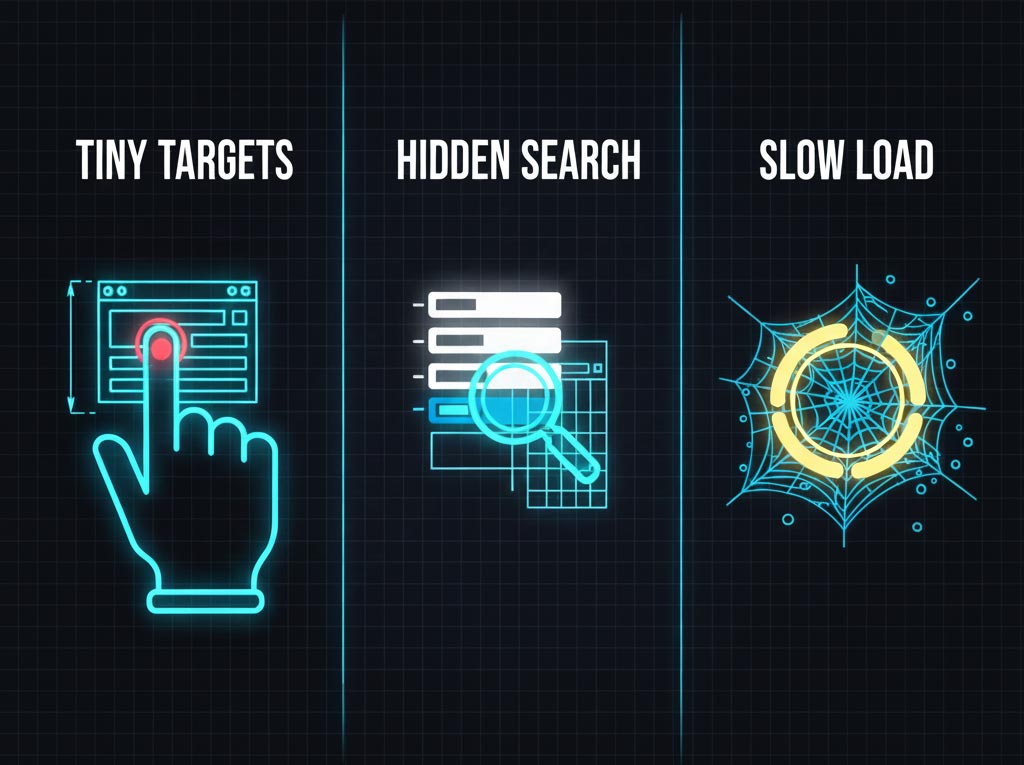
The 3 Deadly Sins of Mobile UX
Instead of abstract theories, you need to look for three specific "sins" that kill mobile sales. If your store commits any of these, you are actively blocking product-market fit.
- The "Tiny Target" Sin: Mobile users navigate with thumbs, not cursors. If your filter checkboxes or "Add to Cart" buttons are too small (under 44x44 pixels), users will miss-tap and get frustrated. This is a primary cause of high bounce rates.
- The "Hidden Search" Sin: On desktop, a small magnifying glass icon is fine. On mobile, search is the primary way users navigate. Hiding the search bar inside a hamburger menu forces an extra tap and hides your most valuable tool.
- The "Slow Load" Sin: Mobile connections are often unstable. If your high-resolution images and scripts take seconds to load, the user is gone. Speed isn't just technical; it's a core part of the discovery experience.
How to validate ideas: Stop guessing, start testing
You don't need complex software prototypes to validate your mobile experience. You need to "shop your own store." Validation is the process of testing your assumptions by trying to buy a product on your own site using a real phone.
The "Fat Finger" Test
Open your store on your smartphone. Try to filter a collection by "Size: Medium" and "Color: Red." Was it easy? Did the filter drawer cover the products? Did you have to pinch-to-zoom? If you struggle, your customers are struggling ten times more.
A/B Testing (Experiments)
Once you identify a fix (e.g., "I need bigger buttons"), you can use A/B testing tools to validate the solution. For example, test a version of your site with a sticky "Buy Now" button against your current version. These experiments provide data-driven proof that UX changes are actually driving sales.
Rapid Search: a mobile-first solution for lightning-fast discovery
Rapid Search is a mobile-first growth search engine designed specifically to solve the unique discovery challenges faced by Shopify stores. While standard search apps are often built for desktop and clumsily adapted for mobile, Rapid Search starts with the small screen in mind. It provides a comprehensive solution that addresses the most common points of friction in the mobile user journey, such as slow scrolling and hard-to-reach buttons.
By focusing on speed, accessibility, and intuitive touch interface design, Rapid Search helps merchants fix their mobile conversion funnels. This tool improves user engagement and captures revenue that would otherwise be lost to a poor experience, ensuring your store performs flawlessly whether on a massive monitor or a smartphone screen.
Key features for a flawless mobile experience
Rapid Search delivers a flawless mobile experience through a set of core, optimized features designed for the thumb zone. First, it includes a prominent, lightning-fast search bar that remains accessible via sticky headers, ensuring users never have to scroll back up to find what they need.
Second, it solves the "fat finger" problem with easily tappable filters. These are designed with large touch targets and housed in intuitive filter drawers, making it effortless to refine searches on a small screen. Finally, its instant results engine displays products in real-time. As the user types, autocomplete suggestions appear immediately, eliminating waiting time and keeping the shopper engaged in a seamless flow from search to checkout.
Conclusion
Mastering mobile product discovery is the difference between a store that frustrates users and one that dominates the market. By treating mobile as a distinct discipline—focused on thumb-friendly navigation, speed, and removing friction—you stop losing sales to poor UX. Whether through a simple "thumb zone" audit or implementing specialized tools like Rapid Search, the goal remains the same: to align your store's experience with the physical reality of the mobile user, ensuring that every tap and swipe leads closer to a purchase.


![How to Filter Shopify Collections by Tag: 4 Methods [2026 Guide]](https://cdn.prod.website-files.com/633a8b3361c84b4d80a64dd6/69d93a420c6647055ee84c87_unnamed%20(3).jpg)
.png)
